Giving a name to a place is an important act. It says a place has meaning, that it should be remembered. For thousands of years, the way we kept track of place names—or toponyms—was by using our memory. Today, we’re not nearly so limited, and the number of toponyms seems to have exploded. Yet oddly enough, the number of places we name in a given area follows a trend uncannily similar to one seen in hunter-gatherer societies.
Eugene Hunn, now a professor emeritus of anthropology at the University of Washington, stumbled upon what appears to be a fundamental relationship between toponyms and population density when he published a paper on the subject in 1994. His discovery stemmed from a literature survey of twelve hunter-gatherer societies from around the globe. Hunn tabulated each society’s toponym repertoire and the size of their home territory to calculate the number of toponyms per square mile, or toponymic density. From this data, he distilled two trends.
First, the average number of toponyms converged on what he called the “magic number 500”. Hunn found that trend in a few other papers on topics like folk taxonomies of plants and animals, and he posited that the number was an inherent limitation of the human mind—that when relying on memory alone, individuals tend to retain names to 500 items per category. A hunter-gatherer, for example, may be able to name 500 different types of plants. Unfortunately, Hunn’s “magic number 500” wasn’t all that magical given the variability about it—individuals in the hunter-gatherer groups he studied actually recalled between 200 to 1000 toponyms. The concept doesn’t appear to have caught on in the academic world.
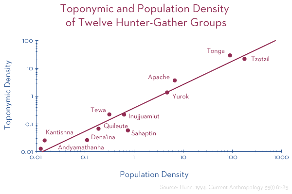
Hunn’s second finding, though, is more compelling. When he arranged the toponymic and population densities of the twelve hunter-gatherer groups on a graph, a clear relationship stood out. Where people lived closer together, the number of place names per square mile skyrocketed. Where they lived farther apart, they named fewer places per square mile. The figure, which I’ve reproduced below, appears to have a linear relationship. That’s an artifact of the logarithmic scale of the axes, which compresses the data as you move away from the origin. The scale is hiding a subtle curve, one that bends down as though the x-axis has roped the line and is pulling it closer.

The general trend in Hunn’s figure—that we name more places when living at higher densities—makes such good sense that I knew there had to be a modern corollary. Despite all our sophisticated maps and petabytes of computer storage, I suspected that we still hew to the same basic pattern as our hunter-gatherer forebears. So I dove into a simple yet relatively modern set of toponyms—the U.S. Postal Service’s ZIP code system.
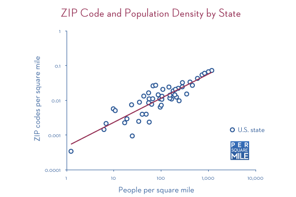
First proposed in the 1940s, ZIP codes were meant to speed the processing of mail at sorting facilities. Most major cities at the time were already divided into postal zones, like “Milwaukee 4”, but small towns and rural areas had no such system. Mail volume swelled after World War II, so the postal service introduced the Zone Improvement Plan in 1963. From what I can tell, there don’t appear to be any hard and fast rules about the size of ZIP codes. Exactly how they are delineated seems to be a postal service secret and one that likely depends on their logistical needs. They can even overlap. But none of that really matters, because ZIP codes give names to places. They’re toponyms. I suspected that the more densely populated states had a higher density of ZIP codes, just like in hunter-gatherer societies. And sure enough, they do.

The wrinkle lies in the trend line’s curve, which is masked by logarithmic axes the same way the curve in Hunn’s figure is hidden. The best way to read both graphs is backwards, from right to left, from high population density to low population density, paying special attention to the scale of the axes. Before we start, we should assume one thing, that people name places at the same rate per square mile regardless of population density. In other words, people will name seven things per square mile regardless of whether they live at ten or 100 people per square mile. Returning to the graphs, if we start at high population densities on the right and move left to lower population densities, the curve drops below our straight line assumption. Not only do people name fewer things at lower population densities, they name fewer things per square mile than our fixed rate assumption would have predicted. In other words, a hypothetical group living at ten people per square mile will name only four things per square mile, compared with the seven named if the population density were 100 people per square mile.
That’s key. There are plenty of gullies and hillocks of grass in the Great Plains, for example, but few people. As such, we name fewer things per square mile. It makes navigation easier—fewer waypoints to remember when traveling—and keeps us focused on the resources that matter. After all, population density is often driven by resource availability, whether that be food, water, shelter, or some other necessity. It’s as though our minds can’t cope with vastness, and so we name fewer things to compress the interstitial space.
The intriguing part is that ZIP codes and Hunn’s hunter-gatherer toponyms are described by one particular mathematical relationship (a power law, for the interested math-types). Not only that, they’re following the trend in a strikingly similar way.¹ As humans, we seem to have settled on a comfortable way of describing the world regardless of whether we remember it with neurons or silicon.
- Toponymic density = 0.3675(population density)0.8388
ZIP code density = 0.0005(population density)0.6944↩
Source:
Hunn, E. (1994). Place-Names, Population Density, and the Magic Number 500 Current Anthropology, 35 (1) DOI: 10.1086/204245
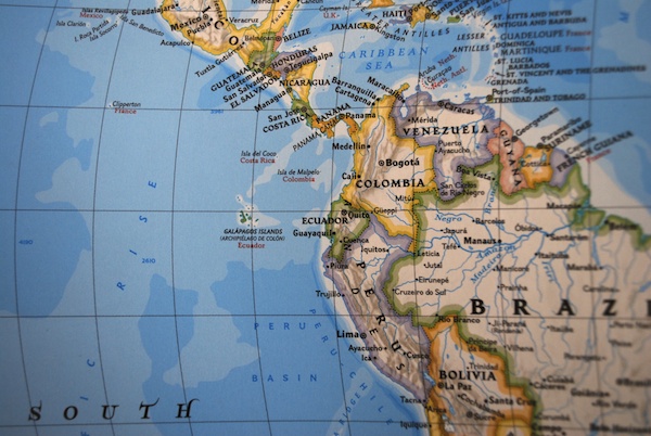
Photo by Tim De Chant.
Related posts:
Density in the pre-Columbian United States: A look at Cahokia
Thinking about how we think about landscapes
Scientific American Guest Blog: Why we live in dangerous places